From quote to confirmation
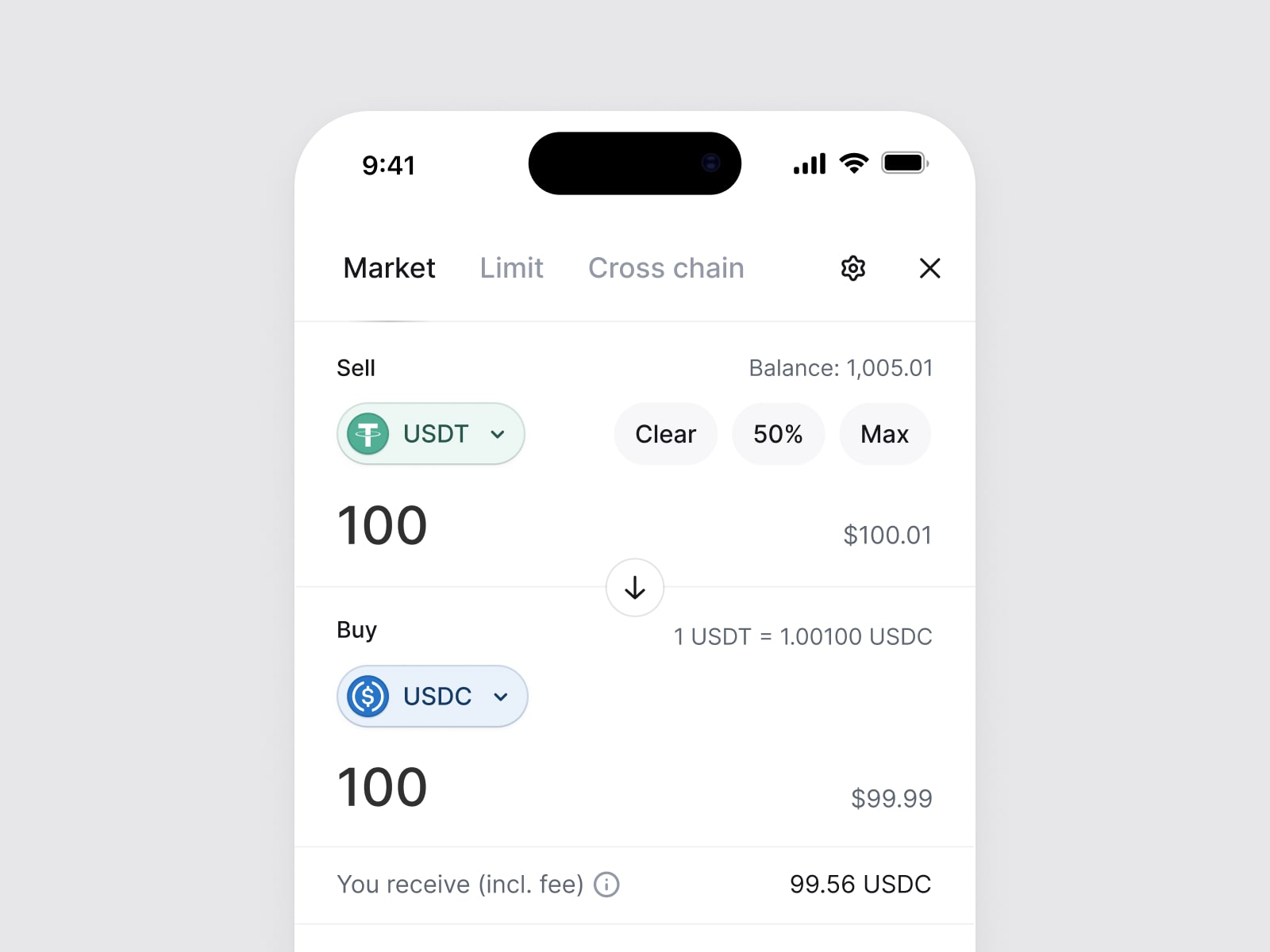
The moment before signing a transaction deserves some space. Up to that point, a person has been editing a form. Now they're being asked to act on it. A large confirmation button is easy to design; a useful explanation of what that button commits them to takes more care.Up to here it is still just a form
I owned the quote, fee, route, and transaction states in Matcha's trade module. The work included amount entry and token selection, but the part I want to talk about here is the handoff from entering a trade to reviewing it.
Give the numbers a clear meaning
The amount entered, the amount expected back, and the network cost answer different questions. If they all look like equally weighted rows of numbers, a person has to work out the hierarchy for themselves. If the secondary details are made too quiet, the form looks simpler at the expense of being inspectable.
In the module, the cost, route, and received amount are available before signing. I want the review to be readable in two passes: first, enough to recognize the trade; then, enough detail to check it. That second pass needs to be possible without losing track of the token pair and amount that started the flow.Recognize it first, check it second
A warning needs room for uncertainty
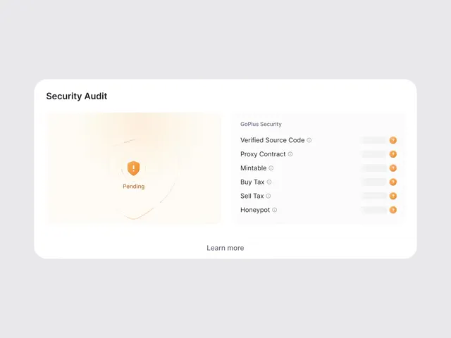
The GoPlus integration added token checks covering source code, tax, minting, and honeypot signals. I designed the loading, pending, warning, and result states. That distinction between states matters: a check that hasn't returned should never read like a reassuring result.
I think of these checks as additional information at the point of a decision. Their presentation shouldn't promise more certainty than the result provides. A row of completed checks can look very authoritative, especially next to a button, so the words and visual emphasis need to be as considered as the warning color.
Let the review earn its place
An extra step is only useful if it helps someone notice something they might otherwise miss. Repeating the form with a new heading can become a habit of clicking through. Changing the arrangement too much creates a different problem: now the person has to learn how to read their own trade again.
The balance I care about is familiarity with a deliberate pause. Keep the transaction recognizable. Bring its consequences into view. Make it easy to go back if something looks wrong. The review has done its job when a person can explain what they're about to approve, even if they decide not to approve it.
Acknowledgements
The trade module was designed at the 0x Project with its product and engineering teams. The token checks shown here use GoPlus data.