Designing Matcha
A swap can fit inside a small rectangle: two tokens, an amount, a button. Designing that rectangle is only part of designing a trading product. Someone still has to find the token, decide whether they want it, choose an account, understand the quote, and work out what happened after they signed.
My work on Matcha covered those surrounding parts as well as the trade itself. I worked on the homepage, token pages, wallets, the trade module, mobile, and the product's dark theme. Looking across them, the question I find most useful is fairly ordinary: what does someone have to remember when they move from here to the next screen?The swap box was never the hard part
Different reasons to arrive
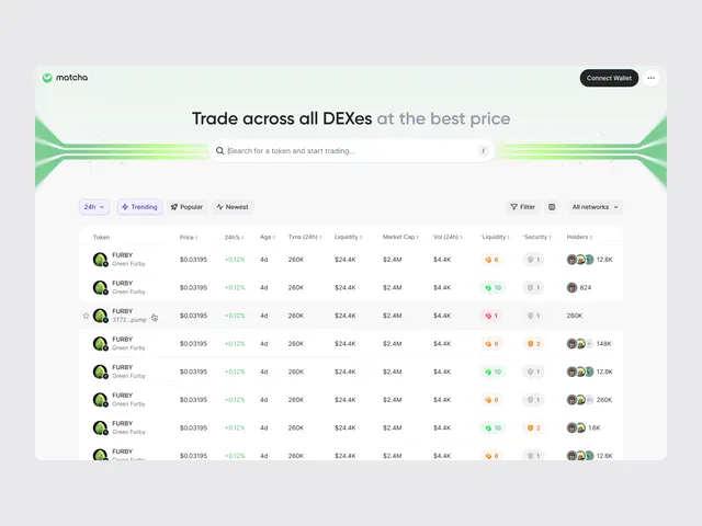
On the homepage, search, market browsing, and wallet connection give people different ways in. A person with a token in mind shouldn't have to browse a showcase first. Someone who is just looking around needs more than an empty trade form. I led the page structure around those different starting points.
That creates a real layout problem. Giving every route equal emphasis makes the page compete with itself. Giving one route all the space makes the others hard to find. The hierarchy has to make a first move obvious while leaving the other doors visible.
The space around the trade
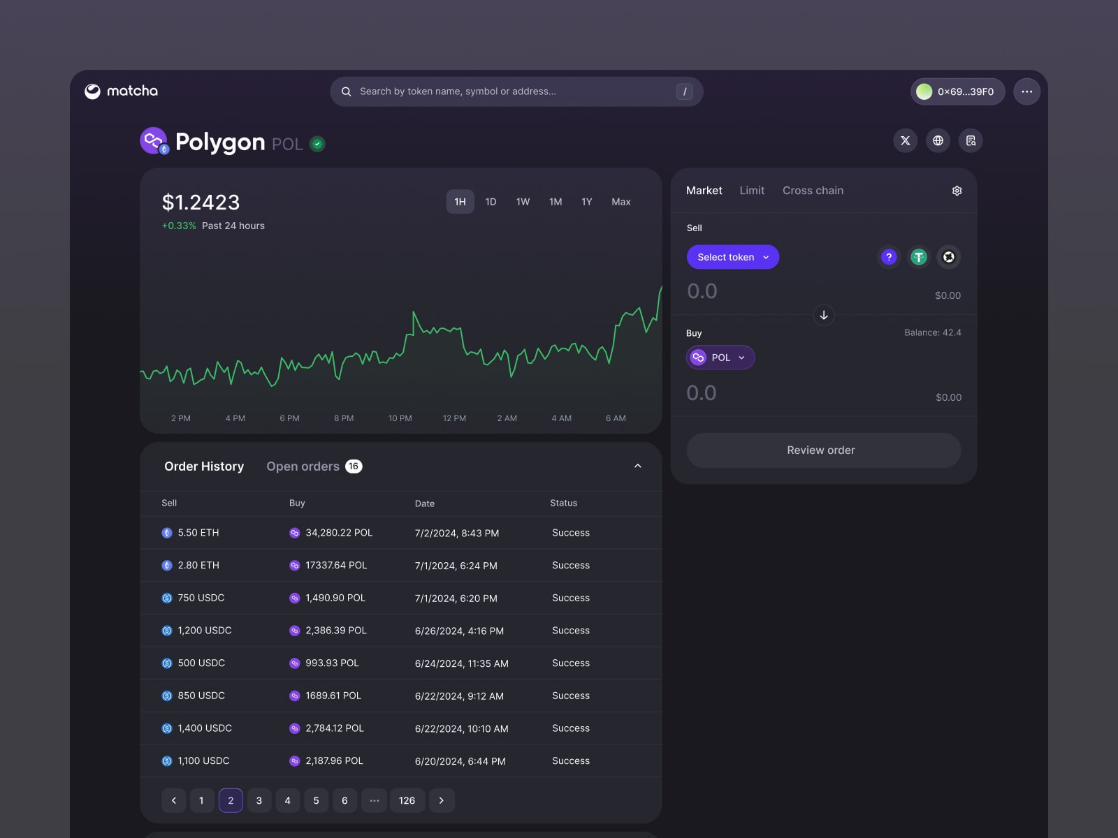
The token page puts market data, charts, trade controls, and order history together. That lets research lead into a trade without a trip to an unrelated page. It also means more things are asking for attention in the same view. A chart can use almost any amount of space you give it; the quote still needs to be readable beside it.
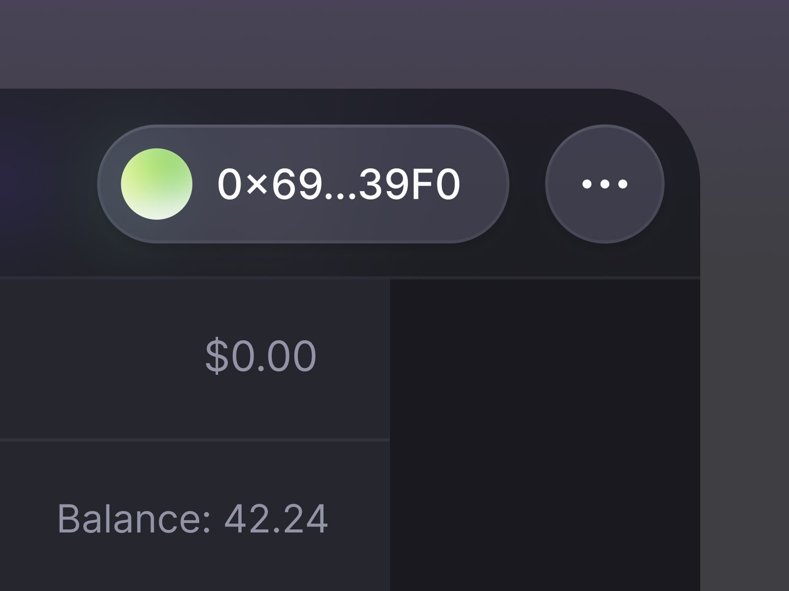
The wallet flow has a less visible kind of continuity. People can switch wallets while keeping their quote and inputs. The account and balance change, but the work of entering a trade doesn't need to disappear with them. Preserving that work matters just as much to the experience as arranging the panels.
A system has to survive the awkward states
The main screens are the easiest part of this work to show. A wallet that is still loading, a token check that hasn't returned, or a quote waiting for confirmation is harder to explain in a portfolio image. Those states still belong to the product, and I designed them alongside the more presentable ones.
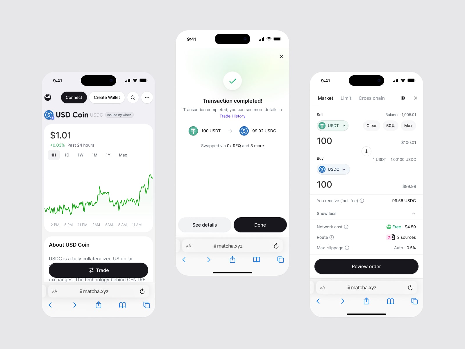
The dark theme needed the same attention across surfaces, component states, and charts. On mobile, the information had to take a different order because it couldn't all sit side by side. Consistency meant keeping the meaning of a control or a status recognizable as its surroundings changed.
What the screens can tell you
These images show the structure and the decisions I worked on. They don't tell me whether someone felt confident during a particular trade, or where they hesitated. I wouldn't want to turn a tidy screenshot into evidence for that.A tidy screenshot proves nothing here
What I can point to is the connection between the pieces: a token carried from discovery into research, a wallet change that preserves the form, and transaction details available before signing. That's the part of this work I want the portfolio to make visible. The individual screens make more sense when you can see what they allow someone to do next.
Acknowledgements
Matcha was designed at the 0x Project, with its product, engineering, and research teams. The screens here are theirs as much as mine; the reading of them is my own.