Designing for active traders
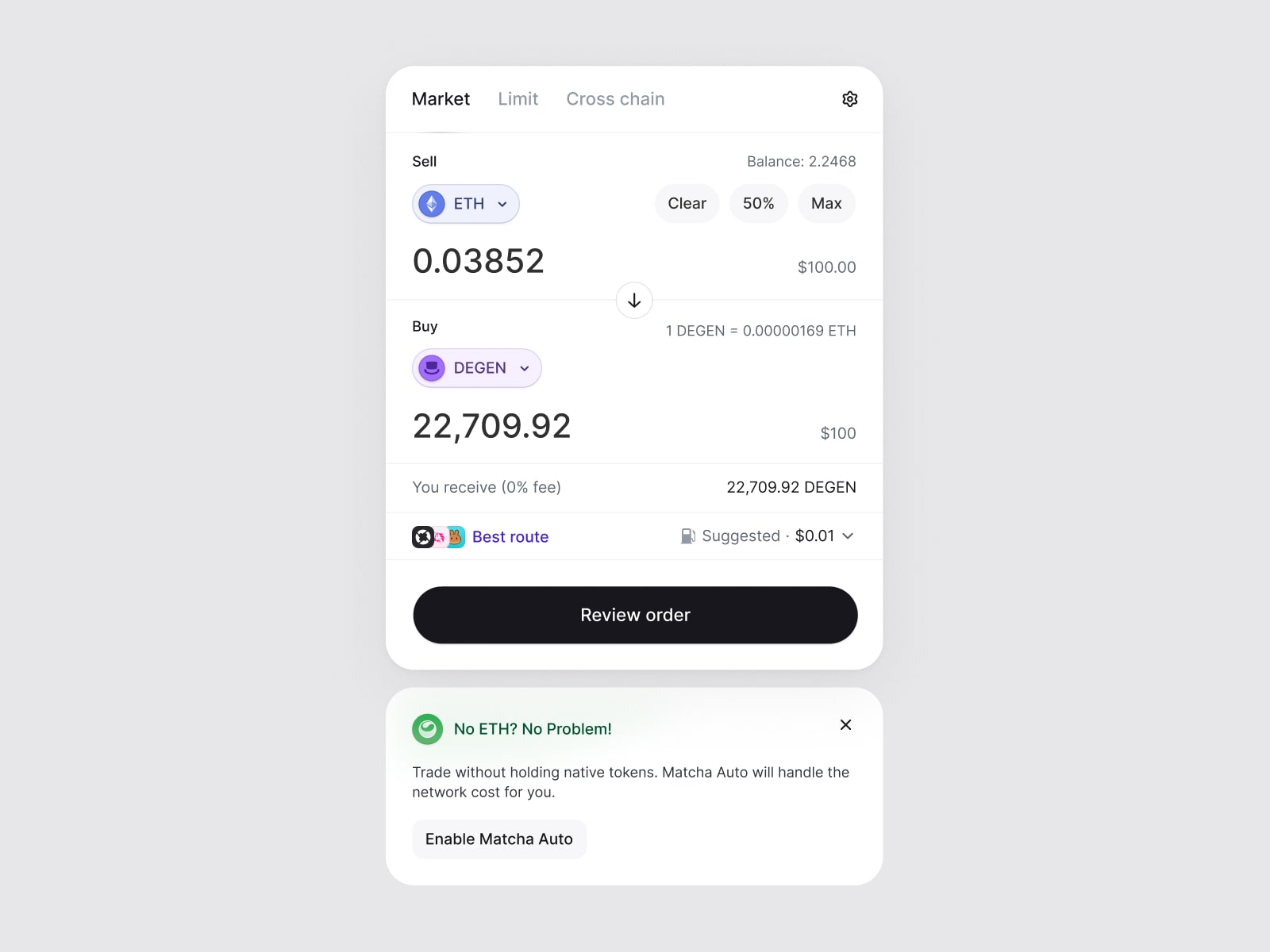
There's a version of interface simplicity that photographs very well: one action, a few numbers, plenty of empty space. It's useful for a focused task. It becomes less convincing when the task involves repeatedly checking a chart, an order, a balance, and a live quote.Photographs better than it works
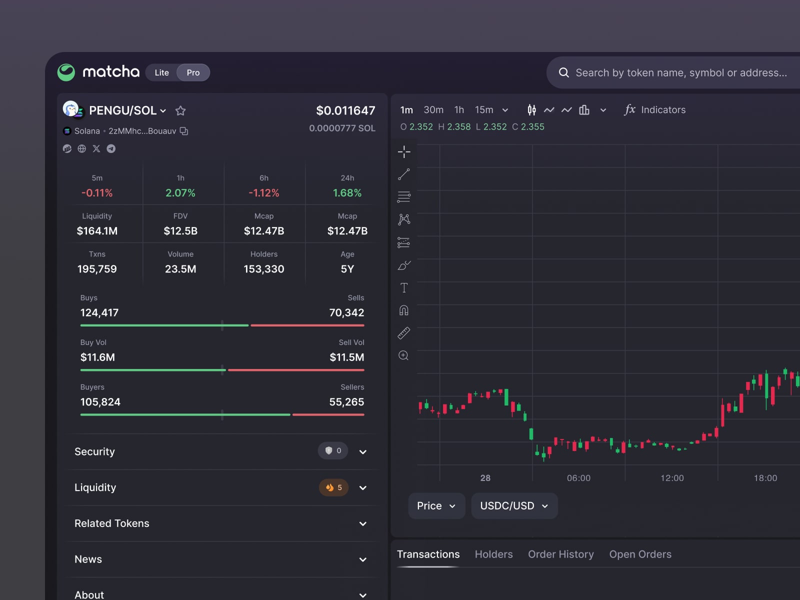
Matcha Pro brings live charts, token signals, transactions, and order management into a denser workspace. I led its product structure and interaction design. The density is the interesting part of that work, because adding information only helps if someone can keep finding what they came back for.
Familiar places for changing information
In a workspace used repeatedly, position does some of the work that labels do on a first visit. A person can learn where to look for an open order or a balance. If the layout keeps changing to accommodate whichever panel has the most content, that familiarity becomes less useful.By visit five you look, you don't read
My preference here is for a stable arrangement with a clear hierarchy inside it. The numbers and activity can change while their places stay recognizable. Density becomes easier to read when related details stay together and each region has an identifiable purpose.
Visible doesn't have to mean loud
A chart, a transaction list, and an order control don't all need the same visual emphasis to remain available. Borders, labels, and spacing can give a panel a place without making it compete with every other panel. Making everything bold would defeat the reason for putting it together.
The main Matcha trade page has a related problem at a different density: it brings the quote, chart, balances, open orders, and history into one layout. In both cases, the work is deciding which relationships are useful to see at the same time.
A dedicated workspace is a choice
Keeping advanced tools in Matcha Pro gives them a dedicated home alongside the standard swap experience. That separation has a cost: there are two contexts for the product to maintain and explain. I think it's worth acknowledging that whenever a more specialized interface is presented as an obvious improvement.
A denser screen earns its place when the surrounding information helps with the task in front of someone. The number of panels isn't evidence by itself. I'd judge the workspace by whether the person can return to the same question, find the relevant detail, and continue their work without hunting for it again.
Acknowledgements
Matcha Pro was designed at the 0x Project, alongside the product and engineering teams who built and shipped it.